1 Sofa, 7 Frames, 7 Looks

When I saw this Gallery Perfect Kit, I just had to buy it. It was affordable, comes with three sets of images, white mats, and all the frames are thin and black, which would look great in any décor scheme, no matter the style or color. To get started, I was inspired to recreate the look shown on the packaging, but once I was done I challenged myself and came up with seven different looks using the seven frames, or one look for every day of the week (just kidding!). It’s amazing how you can get a brand new look for your walls just by switching the frames around.
Note that in the next few weeks, I’ll write about how to hang each look with step-by-step instructions, so make sure to come back to check it out.
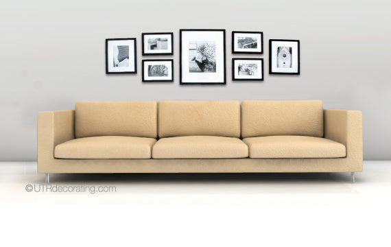
Inspired by the look on the packaging
Since I liked the inspiration look shown on the packaging, I re-created it on my walls. The arrangement is fairly easy to hang. Start by creating a focal point for your display by hanging the largest frame by centering it with the middle cushion of your sofa. Next, hang the two frames on the left or right — it doesn’t matter which side you start with. Complete the look by hanging the frames on the far ends. The spacing between all the frames is identical. See the step-by-step instructions here.
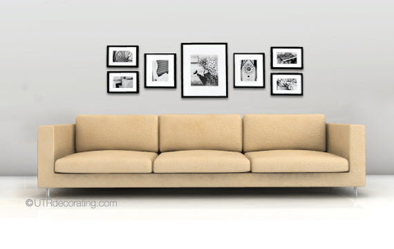
Displayed in the shape of an imaginary rectangle
This look is very similar to the one above. The difference is that I hung the two stacked frames on the ends, where they almost act as book ends to keep the look neatly organized within an imaginary rectangle. Hanging the frames is done in the same order as above. I find that this picture arrangement highlights our focal point (the large frame in the middle) even more so than in the first look.
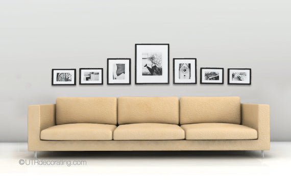
All lined up and spread out
This is such a fun look. I hung the biggest piece first and lined it up with the middle cushion, then I hung the frames on the left, then on the right — you could do the reverse too. This arrangement emphasizes the length of the sofa and fills up the entire wall, creating great visual balance between the couch and the display. By lining up the bottom of all the frames and showcasing them in a pyramid style, I was able to create a very organized and soothing look.
It’s all about the big frame
Here, I build height in the middle and hung the largest frame at the top, as opposed to putting it at the bottom like it’s often done. This gives more presence to the largest frame, so it’s a good place to hang your favorite piece for everybody to see. If you were to draw an imaginary horizontal line in the middle of the display, you’d notice that the weight of the frames at the top and bottom are almost equal. To hang, I lined up the bottoms of the frames from the top row with the tops of the frames in the bottom row.
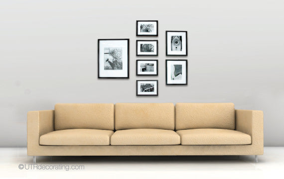
Symmetry in the middle
I created a tall column right in the middle of the arrangement, which creates an illusion of height and is a great way to make low ceilings appear higher. I started by hanging the center frames starting with the bottom frame and worked my way up. It would be very easy to expand this look by adding frames on either side and at the top too to create a large gallery wall. I’d love to add extra frames to cover up the entire wall, which would create an amazing gallery look. A project for a future blog post, perhaps!
Modern & vertically challenged
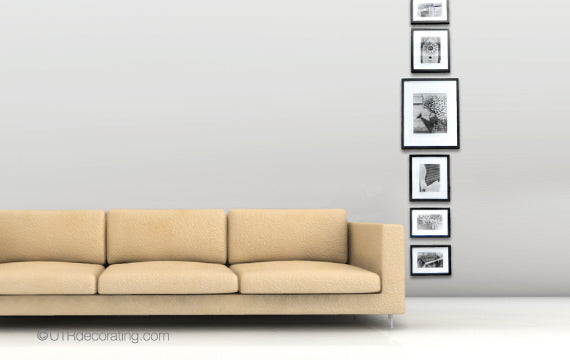
It was so much fun to build this look. It’s so different, since I hung the frames beside the couch versus above it like I did in all the other looks. This look screams “look at me, look at me,” and it’s a definite conversation piece for your living room. This frame display would also look great on any tall skinny walls in your house. I started by hanging the bottom frame and worked my way up. Have fun with this look and hang frames all the way to the ceiling or hang the frames in different order.
Room to grow
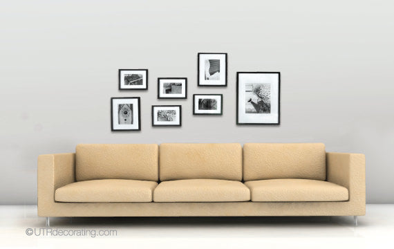
This is a no-fuss, free-style, anything-goes look. Start by hanging frames in the center of the wall above the couch and add from there. I started with the seven frames and could easily add frames to the left, to the right and at the top. I didn’t worry too much about the spacing, so it’s not identical between all frames, which gives our display a more casual feel.
Here’s a tip to get you started:
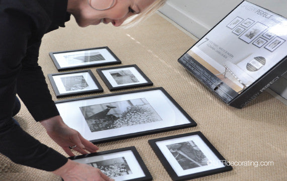
Start by placing your frames on the floor to figure out the best possible arrangement, this will also help you determine the right spacing between each piece. This simple tip will save you time and potential mistake holes too.
After creating the above seven looks I thought of even more fun arrangements I could have done, which shows how versatile this kit is. The black and white images and the thin black frames are timeless and very versatile. I hung the frames above a sofa, but you could hang them anywhere in your house. They’d look great in a dining room, bedroom, office, hallway… anywhere you feel a wall needs a little love.
Come back to see us to see the detailed steps on how to hang all the different looks.
Which look is your favorite?

Liette Tousignant
I’m passionate about picture hanging and decorating (and I’m also the Founder of Under The Roof Decorating)
SHARE:


