Simple design tricks to revive an old sofa


If this couch could talk it would probably thank me for the extra TLC I’ve been giving it lately. Believe it or not it’s 17 years old. I bought it for my first office, then it lived with my kids on a university campus, in their first apartment, in our garage and now it’s back at work in a small condo unit. Although it’s old it’s still in good shape, so I wasn’t ready to part with it. Instead, I gave it a new lease on life with a few simple design tricks.
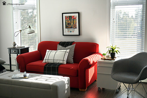
White walls make the couch pop

Painting the walls white was instrumental in making the red couch look more vibrant. The red really pops against the white; the results would have been completely different if the walls were of a different colour. Here, the look is crisp and fresh – not bad for an old couch.
Create a strong focal point with art

Since the couch is the first thing you see when you walk into the tiny condo, I emphasized the focal point with a colourful piece of art. The multi-color New York City scene adds a splash of bright colors to the room, it’s very playful – and who doesn’t want to go to NYC? Your eyes go straight to it when you enter the room.
The art also had to be big enough to cover up the cable TV connection and an electrical outlet which isn’t needed.
Hanging the art close to the sofa helped tie the two together – hanging it any higher would have made it look like it’s floating away from the furniture instead of being connected to it.
Here’s what I did to hang my frame exactly where I wanted:

1: First, I made sure my sofa was centered on the wall. Next, I centered the frame over the couch. I tried different hanging heights – six inches turned out to be perfect. It was not too high, not too low.
2 and 3: The frame was fitted with a sawtooth hook so I used Hang & Level to mark the exact spot on the wall to hammer the Déco Nail in.
4: I hammered the nail in using my small hammer.
5: I levelled the frame using the yellow Hang & Level tool.
6: Done!
Next, it was time to accessorize.
Use trendy cushions to jazz up a couch
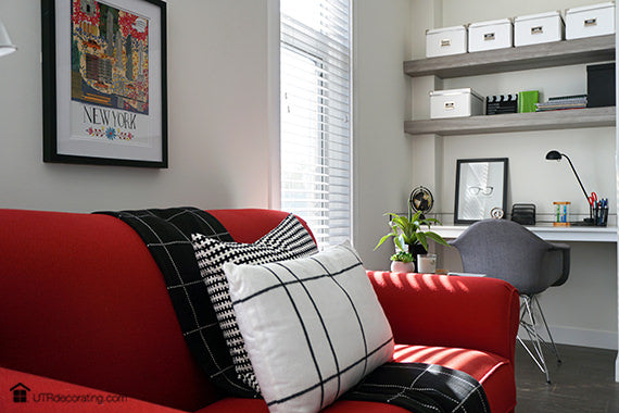
The art went up first, then accessorizing was next. Since the couch has bulky round armrests and back, I dressed it up with black and white pillows with strong patterns to give it a trendier look. I tried bright cushions but they competed too much with the art; neutral cushions were the way to go.
I strategically draped the black throw right in the middle to hide the the separation between the cushions – this way it looks like one long cushion instead of two. In lieu of just “tossing” the cushions on the armrests I layered them over each other with the white one on top to break up the red – it gives the couch a nice tailored look.
Place trendy furniture beside old furniture

Just like using a “designer” accessory helps update an outfit, the same idea also works with furniture. The cool grey chair and glossy white drawer unit on casters make the couch look chic and modern, even if it’s not.

Since it’s a small space, having multi-functional furniture is key. When the chair is not needed in the living room, it’s used in the home office that is inches away from the red sofa.
Use greenery to freshen up a space

Use greenery even if it’s faux to instantly liven up a space – it adds texture and colour.

It was pretty gutsy of me to buy a red couch seventeen years ago, but I don’t regret it – especially considering how beautiful it looks now that it’s all dressed up. Although red is a bright color, it’s one of those neutral colors that goes well with everything and never looks dated. Just like the perfect red lipstick or nail polish, it never goes out of style.
What’s the most daringly-coloured piece of furniture you ever bought? Please share in the comment box below.
P.S. This summer, I spruced up the tiny condo’s balcony, take a look here.
Thanks for dropping by!

Liette Tousignant
SHARE:


