No Art? No Problem! Decorate Your Walls with Empty Frames


Of course, to complete this project you’ll need picture frames. We already had the 3 white ones that we spray painted a few years ago. The gold ones are actually table top frames. We simply removed the glass and backing to hang them up. When we get tired of this look, we’ll pop the glass back in and display them on a table. Simple and versatile!

Hanging pictures is all about trial and error
Although there’s no magic formula when it comes to hanging pictures, there are few tips and tricks to help you hang things without messing up your walls.
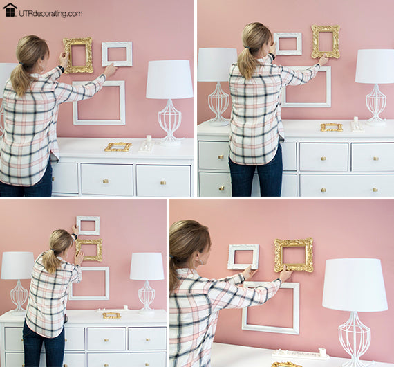
Have a goal or a vision in mind. Ours was to fill the blank wall between the 2 lamps with the 5 frames that we had. We played with different frame combinations before “nailing” the right look. One thing we knew for sure was that the largest frame would anchor the display. The key to a well balanced display is to make sure that the items on either side of the anchor frame are visually equal in weight. We explain that concept right here.
Note that we had no accessories on the dresser when hanging the frames. Accessorizing always comes last. You want to hang your art in relation to the furniture sitting below, then you bring in accessories. Having knick knacks in the way will distract you, plus they are easier to move around than the frames are when trying to achieve your desired look.

How we hung each frame
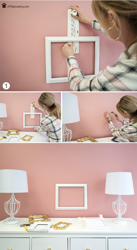
As mentioned above, we hung the largest frame first. Using Hang & Level, we centered the frame with the dresser and hung it approximately 3″ above. That middle frame anchors this display.
Since there was no glass and art in the frames, they were very light in weight, so we just used a tiny nail to hang each frame. The good thing is that if you need to re-hang a frame, the nail hole will hardly be visible. No patching required!
Next, we added frames above the large one, then on the left and right to create a balanced arrangement.
None of the spacing is equal between frames, but yet it looks and feels evenly weighted, don’t you think? The frames are all connected to each other.
Just to recap, here’s the order in which we hung each frame.
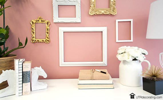
Don’t you love the gold frames? They look so stylish against the rose wall, don’t they? It’s that shabby chic style that is so elegant. The reason why we chose gold frames is simple, it was to enhance the brassy pulls of the dresser. By the way, this is an IKEA dresser that was originally fitted with plain drawer knobs that we switched out for more stylish ones. Do you like it?
Accessorizing – the fun part

When we started accessorizing, we had 2 identical white lamps. But we soon switched one out for a large plant to add life, energy and texture to the space.
Yes, the flowers in the white water jug are faux and we love them. As much as we'd love to have fresh flowers around all the time, that would be way too expensive. Nowadays, faux flowers are so gorgeous that they almost look like the real thing (from a distance). There’s absolutely no shame in using faux.

The funny thing about this picture is that the horse bookends used to be bronze. We decided to paint them white so they’d look better in the pastel color scheme. It’s amazing how paint can transform almost anything.

We always say that a little touch of black adds sophistication and depth to any space, even if it’s a very small dose like with this black jewelry box.

Decorating with books is budget-friendly and they certainly look stylish. Stack them up and display them by showing the spine or the pages, either way is pretty! There are so many creative ways nowadays to display books.
We kept all the accessories very light to create a cohesive color flow and to avoid any colors clashing with the Gilman Rose wall.
What did we learn in this post?
- Decorating doesn’t have to be expensive.
- Empty frames make beautiful art.
- Have the right tools to hang your stuff.
- There ‘s no shame in using faux florals.
- If you don’t like something, paint it!
As always, thanks for dropping by. If you have any comments or suggestions, share them in the comment box below.
SHARE:


