How to create harmony in your gallery wall

Gallery walls are a great way to tell a story with pictures and create a focal point in a room. A basic design principle you can use to create an effective gallery is harmony. Check out these examples that use this principle to create a cohesive looking gallery and try it out for your next project.

What is harmony?
When we talk about ‘harmony’ in interior design we are talking about combining together elements that are related in some way, so they create a pleasing feeling when they are viewed. These elements can be things such as size, shape and color and we'll show some examples of these in this post.
Our brains are very good at recognizing when these elements are working together and the result is that an arrangement simply ‘feels’ right to us. Here are a few things you can consider when putting together a group of pictures that will let you capture a harmonious feeling in your space.

Frame size and harmony
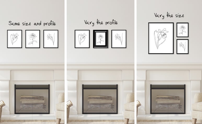
Perhaps the simplest example of harmony when hanging a group of images together is to look at the size of the frames. To make a group of images feel harmonious, put them in the same sized frames and hang them together with consistent spacing between them. The resulting grid of images looks neat and tidy, and the focus is on the artwork inside the frames.
For an arrangement that is still harmonious but with a bit more personality, you can vary some element of the frame - for example keep the size of the frames the same but vary the profile slightly, or use the same frame profile and have different sizes of frames. As long as there are at least one or two aspects of all the elements that are the same, you can establish a harmonious relationship within the gallery.

Artwork style and harmony
Keeping the style of your artwork in each of the frames consistent is another way to introduce harmony into the arrangement. For example, a gallery of all black and white photographs will look more harmonious than a mix of black and white with colored photos.
This can extend to the subject matter, as well as, the technique used to represent the subjects. The more elements of each of the pieces you have in common with the others, the more harmonious the arrangement becomes.

Color and harmony
Color is one of the most effective ways to establish harmony in a gallery. There are two ways of looking at harmony in this context.
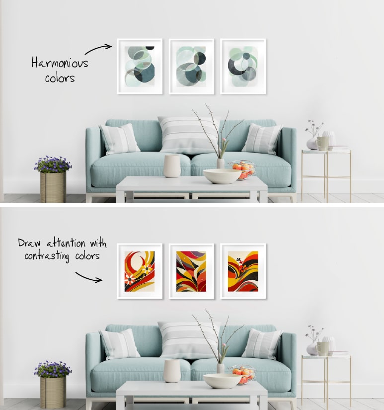
The first is looking at color harmony within the gallery. As we mentioned above, having all of the items in the gallery the same color(s) (e.g. all black and white photos) will make that group of images more harmonious. This can mean that the artwork all share the exact same colors, or similar groups of colors. It can even mean that there is a single color present in each of the images, which are otherwise unrelated.
The second way to look at color harmony is outside the gallery, taking into account how the gallery fits into the decor of the room overall. You can decide whether you want your gallery to blend in with the rest of the room, or to stand out as a focal point. There is no right or wrong answer - the choice is yours.
For example, is your room primarily full of white furniture, light colored walls and floors? Create a gallery using white frames with artwork that is soft and lightly colored for a look that is complementary to the rest of the room and blends in with it to enhance the overall sense of tranquility.
Do you want to bring some different energy into the space? Then choose colors and styles for your artwork that contrast with the colors in the room. In our white room example above, choosing brightly colored artwork draws attention to the area for its contrast with the rest of the room. Keeping some elements of the gallery consistent, such as frame profiles or sizes, makes it feel like it belongs together.

Hanging height and harmony
An easy way to bring harmony to a number of items on the wall in a room is to simply make sure they are hung in such a way that either the tops, bottoms or centers of the artwork are the same height from the floor. Even if the items are different shapes and sizes, having this one element in common will immediately tie them together visually and give you that sense of harmony. This applies even for pieces that you don’t see together in the same view.

Breaking the rules
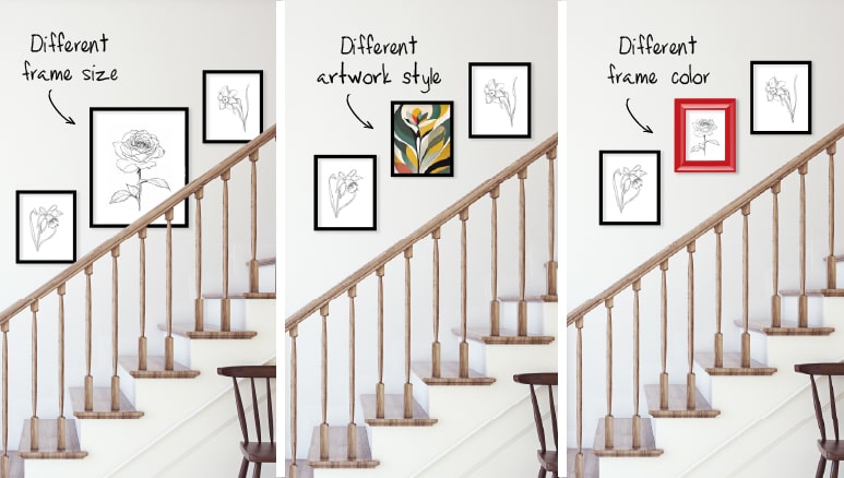
These examples are all about creating the impression that these things naturally belong together, that they are all working together to look balanced. But sometimes you want something to stand out, to draw the eye in, to become the focal point when you enter the room. So we can use what we know about the principle of harmony to make this happen.
For example:
- Make the frame size of the piece you want to emphasize bigger than the rest. Or make the spacing around that one frame different.
- Make the artwork style of that piece you want to emphasize different from the others.
- Choose a different color palette for the piece you want to stand out. The more consistent the rest of the items are to each other, the more the unique one will stand out.

In conclusion - you be you
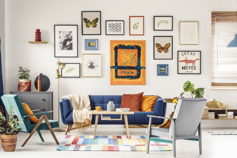
There are no rules that say that you have to decorate your walls in a way that is harmonious - if an eclectic gallery of stuff you love is your vibe then go for it! But if you do want to know how you can tie together a variety of different elements to make them look like they are all intended to work together visually in a more calm manner, looking for ways to introduce harmony into your gallery walls is an easy way to get that cohesive vibe.
We love designing products to make decorating easy and help people create spaces that bring them joy. Click on the live chat below or email us at: questions@utrdecorating.com, and we’ll do our best to help you Create the home you love™
-The UTR Team
SHARE:


