Spruce up a tired bathroom with checkered art

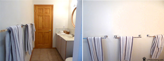
My husband and I are renting a small apartment on a ski hill and although we’re renting I still want the apartment to look inviting. The biggest challenge when decorating the apartment was the bathroom. Because it’s a rental, we couldn’t change the vanity, faucets, light fixture or flooring so what do you do to spruce it up without tearing anything out? Solution – use art and pretty towels. With a few hours of decorating therapy, this bathroom was transformed from a dated rental to cozy mountain living.
The mini makeover
We started by painting the bathroom walls white. Although it may sound boring, white makes the bathroom look larger and brighter. Considering that the light fixture doesn’t throw much light and that there’s no window in the space, white was a brilliant idea.
I chose black frames as a visual anchor for the white walls and to make the red and black art pop. On a side note, I’m a firm believer that every room needs a touch of black – it’s not a design rule just my personal style preference.
The inspiration for the art
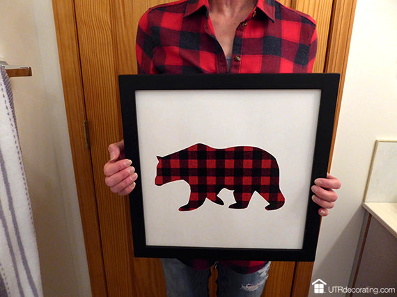
My love for red and black plaid (buffalo plaid) was the inspiration for the artwork. It’s a fun pattern and since the apartment is in the woods on a ski hill where there’s lots of wild life, large animals silhouettes were the perfect theme for this bathroom. I combined those 2 loves: Plaid + Wildlife = plaid animal silhouettes.
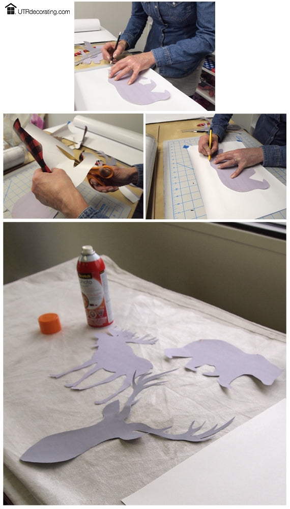
Creating the plaid animals
I used our Place&Push Frames and switched out the original art for plaid artwork we made (click the link to read the how-to steps). If you love the red and black checkered animals as much as I do, you can download the stencils for free from our online catalog. Choose any paper of your choice to make art that will inject style and personality to your space. It’s easy!
Eeny meeny miny moe – which frame goes where

There are 3 towel racks side by side and I wanted to hang a frame above each rack to decorate and break up the long white wall.
Deciding on the order to display the frames was quite interesting, it was almost like reviewing a sitting arrangement of a diner party.
First image: Too many antlers together.
Middle one: Bear butt against moose butt. Not good!
Last one: Perfect! Antlers on either side of the bear, well balanced look.
Hanging the frames – don’t repeat my mistake
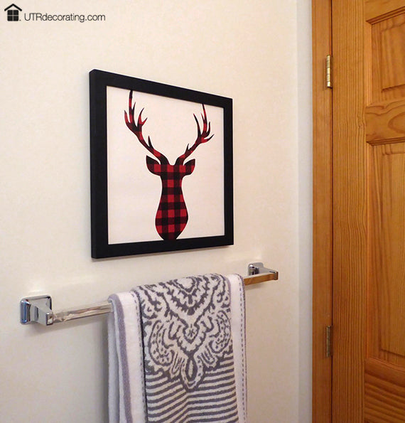
Forget about hanging pictures at eye level in this bathroom, I hung my frames approximately 5 inches above each towel rack – far enough to avoid damaging the frames every time I reach for a towel. I tried hanging them higher but the frames looked like they were floating on the wall instead of being anchored to the towel bars. I highly recommend reading Hanging pictures in a bathroom for more picture hanging tips.
Hanging the 3 frames so they’d be perfectly level to each other was a bit of a hair pulling experience. I made the mistake of measuring from the ceiling to the top of the frame to ensure that all frames would be level but I discovered one teeny tiny detail – the ceiling is crooked. Click on step-by-step instructions to read about how I hung each frame.
Ta-da! Adding the final touches

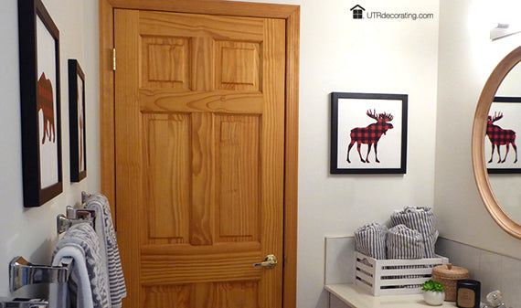
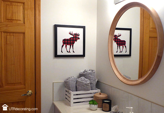
Since the bathroom door is made of pine, I chose a mirror in a similar finish to tie the two together. The wood mirror is perfect, with just the right dosage of chalet warmth.
I chose an oversized round mirror versus a square or rectangular one to add curves and femininity to the space where everything else is very linear. Oh and yes, round mirrors are also super trendy right now so why not add a bit of fashion décor!
I hung a second moose right above the rolled up towels to create a focal point when entering the bathroom. There are 2 doors in this bathroom, one that goes to the bedroom (above) and the other one (that we don’t see) is the main door. The moose sets the tone for this nature inspired bathroom as soon as the door opens. In total, I hung 4 buffalo plaid silhouettes.
I completed the look with two sets of striped grey and white towels – one with vertical stripes and the other with horizontal ones. I mixed the two to add visual interest to the space. I love the versatility of the colour grey, it goes well with almost everything including any wood tone.
When fashion influences home décor
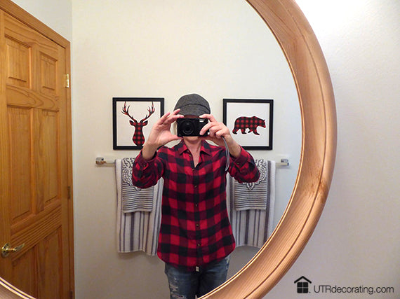
Since fashion influences our choices in home décor I thought I’d have fun when decorating so I wore my trendy red and black plaid shirt.
What do you think of this bathroom mini makeover? Like it? Hate it? I’d love to hear from you, so go ahead and share your thoughts and/or feedback in the comments box below.
Talk to you soon,

Liette Tousignant
SHARE:


