Use frames to hide an architectural eyesore

One of the challenges I had when decorating this small bedroom was to try to hide or disguise an ugly bulkhead. My goal was to create a strong focal point above the bed with picture frames to take the attention away from this architecture eyesore. Of course, I couldn’t do anything too drastic, I just needed a quick cosmetic solution to fix the problem. Here’s what I did – I’m so happy with how it turned out!
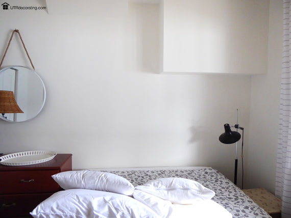
This is what I started with:
This is the guest bedroom in the walkout basement of our family cottage. We bought the cottage as is including many annoying imperfections. Note that the bed is not centered on the wall, which is perfectly OK. Sometimes it’s impossible to centre a piece of furniture against a wall, often because of the size or shape of the room. It forces you to be a bit more creative with your furniture layout and picture arrangement.
Now, don’t be alarmed by all of the following steps. I’m sharing exactly what was going on in my head as I was hanging each frame, because people often ask me to do so. My intent is to make it as easy as possible for you to recreate this look in your own home.
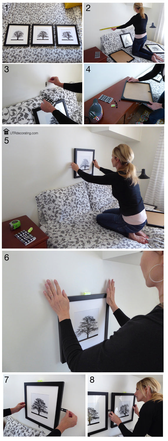
My thought process:
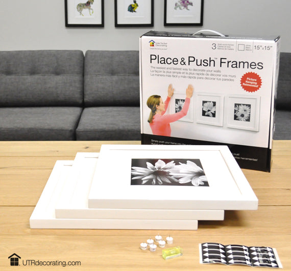
- I used our three black Place&Push
 Frame set.
 - I propped up the pillows just like I would when making the bed. It will help you determine the perfect height to hang your frames. Next, I measured the wall space above the bed to find the middle.
- Mark the centre using a black spacing arrow included in the kit. Use the arrow as a guideline to hang your first frame so its bottom lines up with the top of the arrow.
- Insert the 2 pins in the top corners of each frame.
- Centre the first frame with the arrow making sure that the bottom of the frame lines up with the top of the arrow. Now is the time to adjust the height, have a look. Does it feel too high? Too low? Or is it just right? Pick the perfect spot.
- Use the mini level to level your frame (it comes with the kit) and push to secure it into the wall.
- Place a spacing arrow to the right or left depending on which frame you hang next.
- Line up the second frame with the first one. Line up its side with the tip of the arrow. Level and push to hang. Repeat these easy steps for the third frame and you’re done.
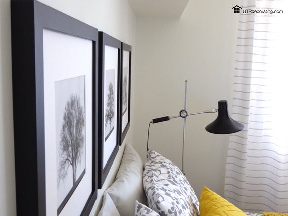
Though you can easily switch the artwork with your own using an easy-to-hold toggle at the bottom of each frame, I thought the combination of the black frames, oversized white mats and simple tree silhouettes was a good choice of art for this bedroom. The black frames anchor the bed nicely and the art isn’t overly busy for this already busy bedroom where there’s lots of patterns and textures mixed together, including striped curtains. Nature scenes are perfect for bedrooms as they inspire relaxation.
As mentioned above, I hung the three frames in relation to the bed and wall space above it. Hang them high enough but not too high for your display to be connected to the bed and act as an “imaginary” headboard. Remember, that was my goal. The display is hanging two Spacer Strips (or arrows) from the top of the pillows. Each Spacer Strip
 arrow measures 2″, making the bottom of these frames 4″ from the top of the pillows. They’re so simple, but they make spacing items evenly a breeze.
By creating a substantial rectangle with the frames to balance out the weight and size of the bed quite nicely, I’ve created a display that is visually appealing.
I love symmetry and this image of perfectly lined up frames is pure joy to me. It projects a sense of order and calmness – and I did that all by myself without putting any extra holes in the wall. By the way, I hung this trio all. by. my. self.
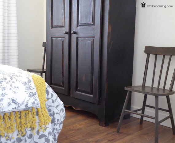
And just in case you’re wondering what’s on the other side of the room, I’ll show you! I have a tall black vintage armoire standing proudly at the foot of the bed. It holds everything from bedding to beach towels. I’m always amazed by the amount of stuff I can neatly hide behind those two tall doors. It’s flanked by a couple a vintage chairs I snatched up at a garage sale for a few dollars. I love a good bargain.
When I first started this picture hanging project it was to camouflage the bulkhead. With the artwork installed, the eye is drawn to the perfectly symmetrical artwork, and the bulkhead is hardly noticable. The best of this creative solution is that it’s purely cosmetic – no costly or messy construction required.
The Place&Push Frames come in black and in white and come packaged smartly in this pretty box. Put a bow on it and it makes the perfect house-warming present or Christmas gift. Shop for your set today!
What do you think of this new way of hanging pictures? I’d love to hear from you! Feel free to leave a note in the comment box below.

Liette Tousignant
Co-Founder of Under The Roof Decorating
SHARE:


